But this makes me think about my favourite RPG book covers. What are the covers that stand out in my mind as being genuinely excellent? Because, let's face it, most RPG art is studiously mediocre. I'll narrow it down to a top 3.
1. The Keith Parkinson Rifts cover. I've never in my life played or owned Rifts, but I remember seeing this book in a shop somewhere when I was a kid and thinking it was among the greatest things I'd ever seen - to 9 year old me, it felt properly edgy and adult and even a wee bit scary. You shouldn't underestimate the power of genuine weirdness to entice young and impressionable minds.

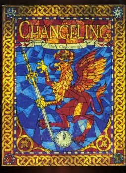
2. The Changeling: The Dreaming cover. The game itself is emo to-the-max, but this cover is like no other cover that there has ever been for a game before or since. Like it or not, it's different. It says: this is going to be something unique. And it gives almost nothing away. All you know is that it makes you curious to know what's inside.
3. The Planescape campaign setting cover. Again, like with Rifts, I can remember the first time I saw the cover to Planescape - it was in, of all places, Tel Aviv, in a game shop I had wandered into. I remember just thinking, "What's that all about?" The Lady of Pain logo looked almost like some Pacific Island idol or Mayan bas-relief, but then what's underneath is, again, like nothing you've ever seen on the cover of an RPG before or since. I think of all RPG covers out there, this may be one of the absolute bravest, because it says almost nothing and has almost no real content: it's for all intents-and-purposes a weird street in a weird city with people walking along it. If that. But it has a feel; the feel pulls you in. You have to wonder who commissioned it - who said, "Yes, that will be exciting and make people want to play it." The painting has no earthly business being the cover of a flagship AD&D boxed set. It's not awesome-adventurer-striking-an-awesome-pose school; it's not monsters, monsters, rahh school; it's not let's-go-adventuring-AD&D-first-edition school; it's.... trippy and vague and ephemeral and you're not sure what's going on school. And in its own way, that gave it a wow factor beyond dragons and beholders and people with big swords.

Original Players Handbook. It wasnt a pose it was a story and it provided the feel of adventure in a way most covers do not.
ReplyDeleteThe Travelor 2300 cover did a similar job (although the adventurers were posing a bit for the artist)
ReplyDeleteYes, I love the Rifts cover as well. And I'm also not really enthused about the 5th edition covers.
ReplyDeleteRifts covers bounce incredible photons.
ReplyDeleteI think great cover art is 50% nostalgia. I look back on the AD&D books and objectively much of the art is horrible, but I love it all. The uncropped versions of two of the new covers are available here:
ReplyDeletehttp://tylerjacobson.blogspot.com/2014/05/d-core-books.html
I absolutely agree. Some of the stuff in the AD&D 2nd edition Monstrous Manual is awful, as is a lot of the Rules Cyclopedia interior illos, but they're still very lovable. I like Tyler Jacobson's style and he's obviously very talented but there is something slightly too stylised for me about the poses of the characters in those pieces. I do really like the giant though, taken in the abstract.
DeleteI think the same thing. I find myself nostalgic for the amateur black line drawings of the first version of AD&D, even the classic two dimensional monster manual that looked like it was done with crayons. Then again I've found myself sniffing like this when book shopping as well. I miss the old Frazetta covers on fantasy books and the odd abstract art that used to show up on the "classy" scfi.
DeleteI loved many of the covers for the old MERP products. And I still, after all these years, love the original AD&D 2e covers (PHB, DMG and MC I) although I'll admit it's perhaps nostalgia as I was just 17 in 1989.
ReplyDeleteObviously all of the above is trumped by the first RPG I owned and played, Mentzer's edited Basic Set.
I am still not sure I like the 5e covers, although I consider them far better than the 4e and Pathfinder ones.
The gold standard is the cover for player's handbook 1st ed. It's a pity that Wizards didn't have the courage to simply use an updated version of that cover or at least a cover that was heavily inspired by it. My problem with the new covers is that they are generic. They simply don't inspire my imagination at all.
ReplyDeleteThe editions "Oriflam", who by then published the french translations of the Chaosium games , had very nice covers for RueQuest and Pendragon
ReplyDeleteYou can see them here:
http://www.legrog.org/visuels/couvertures/2021.jpg
http://www.legrog.org/visuels/couvertures/4273.jpg